real estate enablers

a new era with a new image: how IZILEND’s rebranding elevates the brand’s positioning and identity.
-
the brand
IZILEND is a company specialised in offering alternative financing solutions to real estate investors. Its focus on offering a flexible and fast solution when customers need it most has resulted in a strong brand status – especially in Spain and Portugal.
-
the challenge
The natural evolution of the brand and the new market demands led to IZILEND's need to update its image so that it would be more in line with the refined and diligent positioning they were building.
-
the story
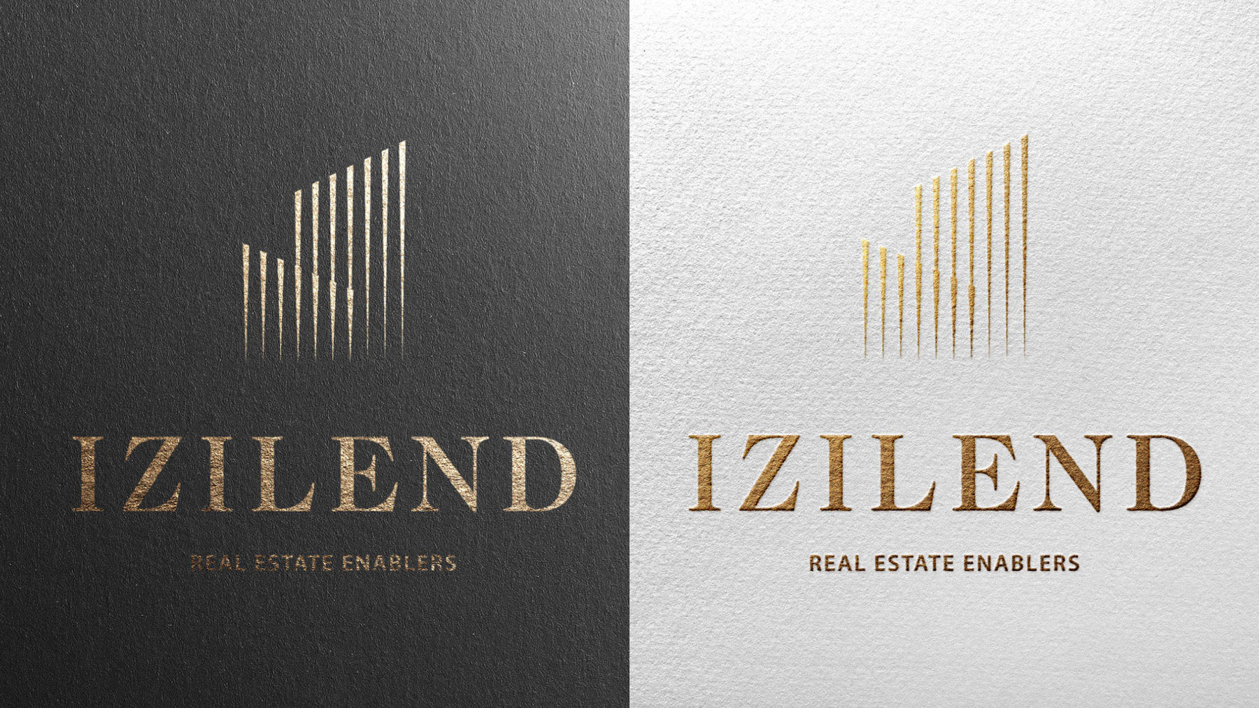
In this sense, we ensured the rebranding process, using as a starting point the golden tones, which refer to sophistication, and the straight lines that convey credibility, accuracy and discreetly reference the brand’s initial.

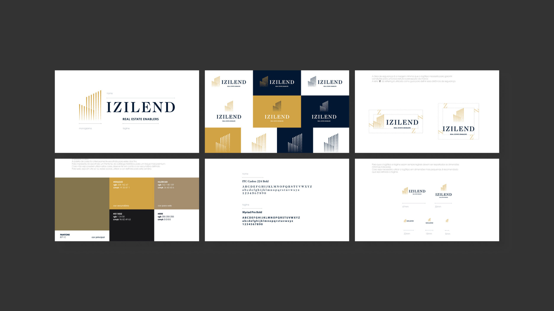
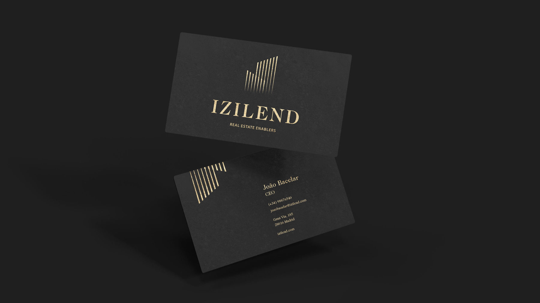
The new IZILEND identity thus assumes an urban and corporate influence, whose angles subtly reveal the shape of buildings – the main element of the entire IZILEND business line. A brand manual was also developed to provide guidance on the communication.
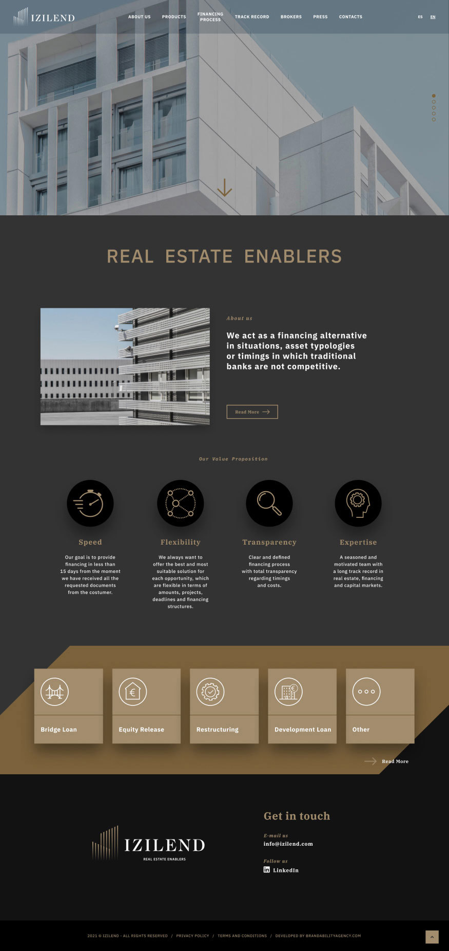
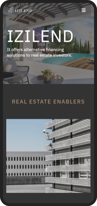
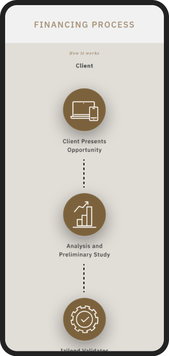
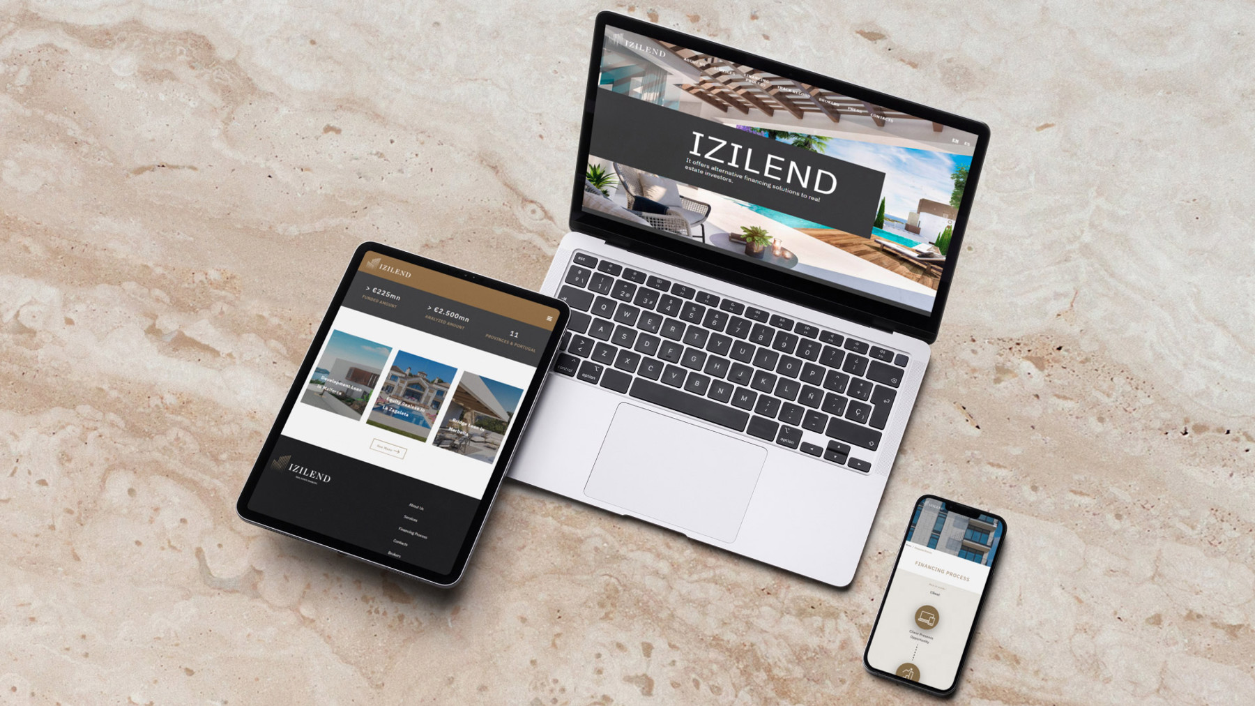
A website was also developed with this new visual identity and features improvements, including new areas such as project dissemination, a news area and the presentation of the business financing solutions that IZILEND has at the disposal of its customers.


With an image more aligned with its market segment and the notoriety that has been building throughout its activity, the rebranding of IZILEND tells a story about sophistication, power and commitment, which, consequently, is an added value to communicate the brand’s values and services.